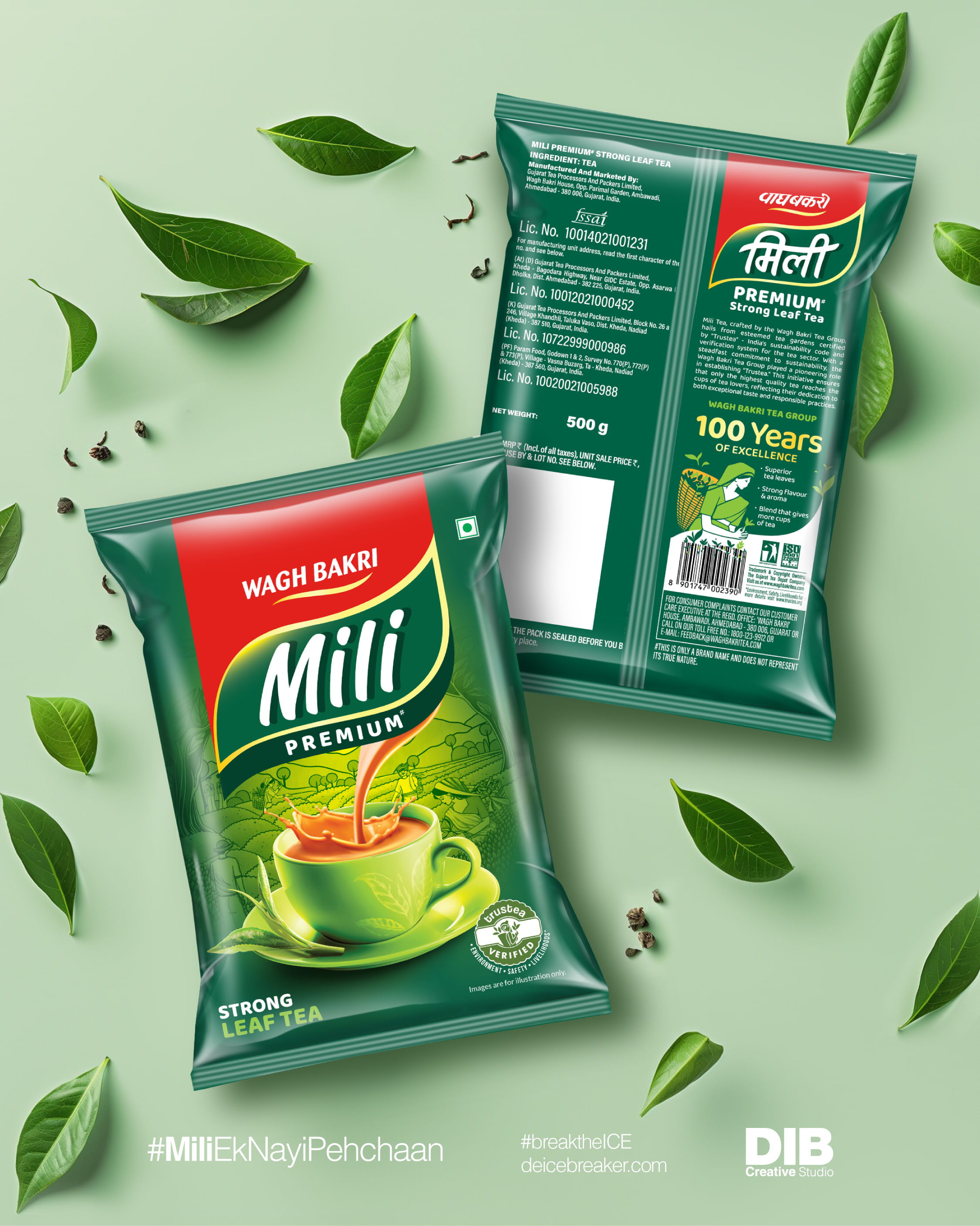
The revamp of Mili Tea by De Icebreaker Creative Studio
At De Icebreaker Creative Studio (DIB), a recent project involved revamping the packaging for Mili, a legacy brand under Wagh Bakri, targeting rural areas of western India. Given Mili's history of packaging changes, the company was tasked with infusing modernity while leveraging its legacy recall value
29 Apr 2024 | 4222 Views | By Abhay Avadhani
Mili’s logo was analysed, and it closely resembled detergent more than tea brands. De Icebreaker Creative Studio (DIB) claims to craft a fine-tuned logo design with a mix of tradition and modernity.
Central to the design was a backdrop illustration of a tea garden, paying homage to tea farmers while balancing the tea cup and the splash falling from the logo. This fusion of elements breathed life into Mili's packaging, ensuring it stood out on shelves.
DIB’s involvement extended beyond design to post-production printing services. The team worked closely with the printing team at Wagh Bakri, cylinder manufacturers, and printers to ensure the design integrity was maintained.
This project underscores the importance of strategic problem-solving in FMCG packaging design.
Design challenges
There were several design challenges primarily centred around the adaptation of the packaging across a range of SKUs. From small sachets priced at Rs 5 to 100-gram boxes and even larger buckets, each form presented proportions that demanded a flexible and adaptable design approach.
One of the key features was the tea fall, designed to evoke a sense of levitation. However, translating this feature across various packaging sizes proved to be tricky. The curves of the tea fall had to be adjusted to maintain their intended effect, especially as the length-to-width ratio varied across different packaging formats.
Navigating these complexities not only made the project more engaging but also contributed to the landscape of packaging design.
Customer feedback
As the new Mili packs have recently been introduced to the market with a limited selection of SKUs, the company is still in the process of gathering feedback from end consumers regarding their reaction to this shift. However, DIB claims to have received positive feedback from the client, Wagh Bakri, who is satisfied with revitalising the Mili tea packs while preserving its core essence.

DIB crafted a fine-tuned logo design with a mix of tradition and modernity
Sustainability quotient
DIB focused on the four Ps of sustainability: Purpose, profit, people, and planet, recognising their nature within the context of its work.
The company tried to address the 'people' aspect by incorporating a backdrop illustration dedicated to the hardworking tea farmers. This not only honoured their contribution but also connected consumers to the human element behind the product.
Team DIB told the WhatPackaging? team, “We aimed to facilitate a smooth transition from the old packaging to the new one for both consumers and our client, Wagh Bakri. Despite its convenience, refreshing the packaging while preserving its essence posed significant challenges, highlighting our commitment to purpose-driven design.”
Due to India falling into the second and third world country category and Wagh Bakri placing Mili in the rural regions of Western India, there is a certain price point which the firm has to meet. Hence, the target audience might not be able to prioritise sustainability over costs.
By integrating these sustainability principles into the packaging design process, DIB aimed to create not just visually appealing products, but ones that resonate with consumers, stakeholders, and contribute positively to the environment.