Pack View: Packaging power personified
A packaging expert Shashwat Das, founder director, Almond Brand Strategy & Design analyses five new products in the market on the basis of aesthetic appeal, technical specifications, design aspects and sustainability and shares with Disha Chakraborty of WhatPackaging?
05 Sep 2023 | By Disha Chakraborty
Shashwat Das, founder and director of Almond Brand strategy and design, reviewed five packaging for the readers of WhatPackaging? magazine.
Orika GunPowder
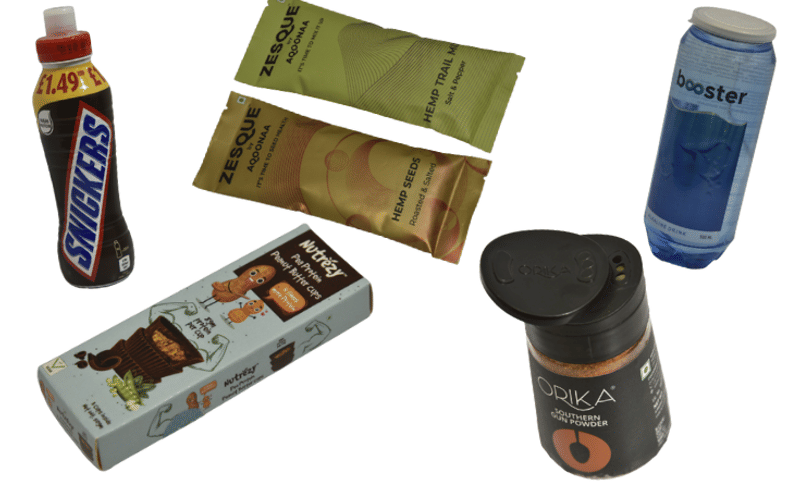
The Orika GunPowder pack is interesting in many ways. The transparent cylindrical PET bottle tapers to the top and has a unique two-way moisture-resistant cap. Interestingly the cap is not flat but wavy at the top giving it an elegant modern look. The lid opens two ways, one side is a sprinkler, and the second opens to a bigger hole. The brand colour black seamlessly flows between the label colour and the cap fixture, giving it a premium feel. The spoon visual element, which is part of the Orika design language, stands out beautifully, flaunting the orange variant colour of the gunpowder Inside. The BOP design effectively promotes multiple applications, which is a great idea to encourage pickups and trials.
Nutrezy Pea protein Peanut Butter Cups
The packaging has an overall adorable and eye-catching design that exudes a playful and kiddy appeal. The illustrative peanut characters' presence adds charm and stands out on the shelf. The use of casual font styles further enhances the approachability of the packaging, giving it a friendly and approachable vibe. One of the standout features of the packaging is its practicality. The format is designed to be convenient to carry and store, making it a perfect on-the-go snack option. Its compact size allows it to easily fit into a pocket or bag, ensuring that consumers can enjoy the product whenever hunger strikes, whether they are at work, travelling, or running errands. The primary product proposition, which is the high protein content, is prominently communicated multiple times on the packaging. It helps to immediately convey the product's key selling point to potential buyers. The clear emphasis on its protein content could attract health-conscious customers looking for a tasty yet nutritious treat. The only glitch I noticed is that the size of the Veg logo doesn't seem to be as per standards.
Snickers flavoured milk
The Snickers flavoured milk packaging is designed with practicality in mind. Its slender shape and excellent grip promote the product as a convenient ready-to-drink option. The prominent and bold Snickers branding, displayed diagonally, ensures it stands out on the shelf. The clever integration of the price blurb with the high protein mnemonic creates a cohesive and engaging flow of information. The "Drink Cold. Shake well" message is emphasised in red on the BOP, guiding consumers on how to enjoy the product. While the brown background colour conveys the chocolaty feel of the Snickers flavour, the other flavouring ingredients like caramel and peanut are revealed on the fine print on BOP. The FOP displays the volume and calorie count, ensuring product content transparency. Additionally, the packaging showcases its commitment to sustainability, emphasising that it's made of 50% recycled plastic and fully recyclable, including both the bottle and foil.
Booster Alkaline drink
The Booster Alkaline drink has a sleek and cool appearance that sets it apart from typical beverages. The transparent PET bottle's subtle blue tinge gives it a unique and refreshing vibe. The metallic pull-open cap, reminiscent of a Coke can, adds a touch of sophistication, complemented by the additional layer of plastic cap for added protection. The branding of Booster in small caps with the infinite symbol replacing the Os gives the packaging a youthful and aspirational feel. The metallic sheen behind the blue ocean theme is a clever touch; the visibility of the whale visuals could be improved due to the monotone look. The packaging conveys the message of being a healthy beverage. The design is likely to attract the new-age audience looking for a wholesome drink option.
Zesque by Aqoonaa
The Zesque by Aqoonaa pack stands out with its elegant simplicity. The clear branding and product description in black against a gold background communicates the message, leaving no room for confusion. The choice of material for the sachet is commendable, as its thickness renders a great touch and feel. The matte metallic finish further enhances the premium look and feel of the packaging, adding to its overall appeal. The pattern on the pack, suggesting a touch of science and technology, is intriguing and unique. However, there is room for improvement. Incorporating a visual or design element that clearly signifies its nature as food packaging would be beneficial. It would help create an instant connection with the product’s purpose and target audience, ensuring a more effective and enticing appeal.


