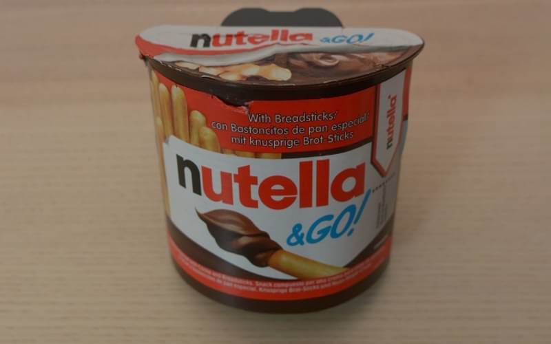
Pack View: Nutella & Go
Two packaging experts analyse five products in the market. The matrix they deploy is: aesthetic appeal, technical specifications, design aspects and above all, sustainability. Disha Chakraborty of WhatPackaging? reports
16 May 2024 | By Disha Chakraborty
 Jashvi Shah, Ctrl M
When I see this snack, it reminds me of fun road trips with close ones, stopping for snacks along the way. Nutella & Go lives up to its name, giving you convenience and satisfaction.
The separate breadsticks and Nutella dip keep the crunch, even if you eat them later after opening.
Maintaining the iconic Nutella red hue longside the bold logo exemplifies brand consistency and recognition.
However, it’s worth noting that the product is positioned at a higher price point relative to the quantity offered.
Pawan Kulkarni, Packfora

An innovative package design that not only enhances consumption convenience but also communicates its contents at a glance through design. The front panel is made to look like a traditional Nutella jar which instantly strikes a connection in the mind of the consumer.
The lid laminate is a cost-effective alternative to a cap and also provides the required barrier properties, however the reclosable feature seems to be necessary for such a product.
Resealable labels can be explored for same.experience however, opening the cap is a little challenging as the flexible pouch keeps getting twisted and the gusset provided at the bottom doesn't effectively serve to keep the pack stable upright as it is curved.


