Pack View: Le Pure
Two packaging experts analyse the Le Pure packaging based on aesthetic appeal, technical specifications, design and sustainability
21 Nov 2023 | By Disha Chakraborty
Sneh Sheth, The Design People
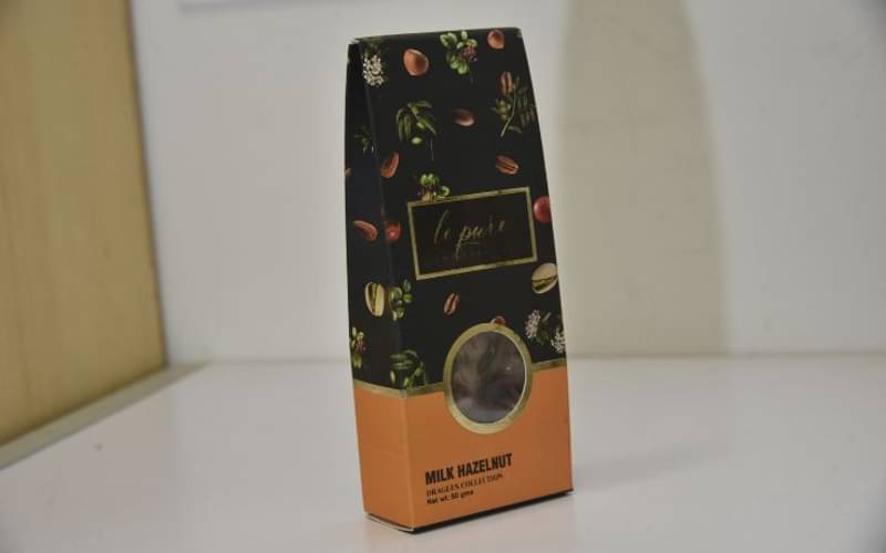
 The Stand-up pouch structure, which includes a die-cut in the centre with a plastic window, is unique to the category and contributes significantly to the premium feel of the product. The velvet finish printing effects along with gold foil accents makes the pack look very enticing. Additionally, the use of Spot UV coating on the ingredient list enhances the overall visual appeal.
The format of pack graphics with vibrant contrasting colour division gives the pack very good shelf throw. It will also allow the pack to have variant extensions in a very smooth way. The graphics effectively convey the product's richness and appeal, reinforcing its premium positioning in the market.
The product's cost is justified by the luxurious look and feel of the packaging, aligning with the consumer's expectations for a high-quality product. The presence of a product window provides consumers with a clear view of what's inside, offering transparency and helping them make informed purchasing decisions.
Karishma Sawant, General Mills
 Aesthetically pleasant paper-based packaging with a window. Packaging comprises two components: pouch and outer box with a window. The pouch is made up of transparent PET/POLY and the outer box is made of 400gsm paper. The window provides an enticing view of the chocolate inside, making it look delicious and appealing potential to customers. The window size on the pack is appropriately seized and placed without compromising the structural integrity of the box. The complete pack is sturdy enough to protect the chocolate from external factors like light, temperature, handling,and transportation.
The box has the additional feature of easy opening and resealing. All the necessary regulatory information such as nutritional panel, storage condition, and allergy information is clearly visible on the packaging. Le -pure used a unique, very compact,travel-friendly box design and attractive artwork with matt finished black and orange colour as the base.
The graphics consist of hints of chocolate flavour(hazelnut, coffee etc.) which is enhanced by spot UV treatment and branding at the centre with gold foil. Overall, the design and colour scheme reflect the brand identity and create a positive impression. The Le Pure Packprovidesa premium and fulfilling experience to consumers from initial attraction to unboxing.


