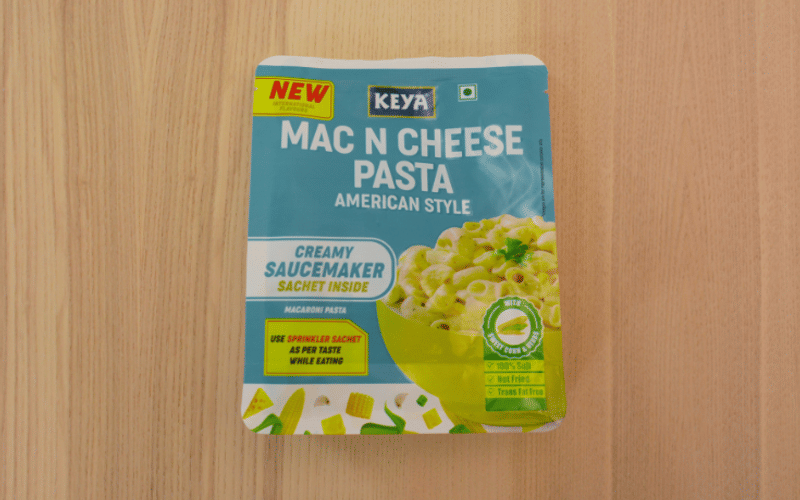
Pack View: Keya Mac N Cheese
Two packaging experts analyse five products in the market. The matrix they deploy is: aesthetic appeal, technical specifications, design aspects and above all, sustainability. Disha Chakraborty of WhatPackaging? reports
23 May 2024 | By Disha Chakraborty
 Jashvi Shah, Ctrl M
In an era where convenient snacking is paramount, the positioning of the 'Ready in 5 mins' claim at the rear of the packaging, particularly in a small font, does not resonate effectively.
Although the packaging’s overall design, with its captivating ingredient pattern extending across the sides and bottom, exudes appeal, the front appears somewhat cluttered and lacks a clear reading hierarchy.
To optimise consumer comprehension and engagement, prioritising a streamlined front design with a clearer hierarchy of information could enhance the packaging’s effectiveness.
This strategic adjustment would ensure that essential product attributes, such as preparation time, are prominently featured, thus aligning with consumer preferences for quick and convenient snacking options.
Pawan Kulkarni, Packfora

Registered matte used for the finish gives a 3D effect to attract the consumer.
Double notch for ease of opening. Side and bottom gusset allow the pack to stand upright but is leading to a lot of plastic consumption. There is scope to optimise the same.


