Pack View: Colgate toothpaste
Two packaging experts analyse five products in the market. The matrix they deploy is: aesthetic appeal, technical specifications, design aspects and above all, sustainability. Disha Chakraborty of WhatPackaging? reports
21 Mar 2024 | By Disha Chakraborty
 Pravin Pisal, Thinking Forks
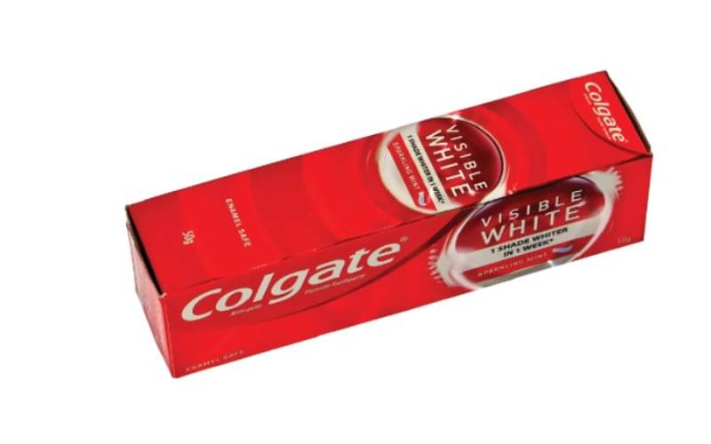
A vibrant coloured Colgate toothpaste 50gm pack stands out on shelf and catches the attention of consumers. Pack graphics are well designed with teeth and superbly printed and laminated with grey back paperboard.
Metallised effect with printed metalised film on carton provides a high degree of shine to the pack.
Red and white colour effectively used in the artwork. Hot melt is used on carton flaps for tamper evidence and optimises the usage of board. Pack with recycle logo 7 slightly takes it away from 100% biodegradable pack claim.
Soma Roy, Bajaj Electricals

12 micron printed MET PET carton with a 300 gsm of grey back duplex plus hologram effect. It is a printed and laminated metallic tube.
The carton print is excellent and vibrant. The red colour of the ink and the reflectance is justified using a met pet base in combination with a hologram to give it a lenticular impact.
The different font takes away from the brand experience. On the back of the pack, a lot of typography has been distorted. I feel, the choice of font could be better to aid legibility in this small size.


